Borboleta Rebrand
Challenge
Recharge the iconic professional lash brand, Borboleta, with a clarified vision and upgraded branding to harmoniously live alongside its DTC brand, streamline its user experience, and differentiate from its competition in a rapidly expanding market.
My Role
Brand Strategy
Creative Direction
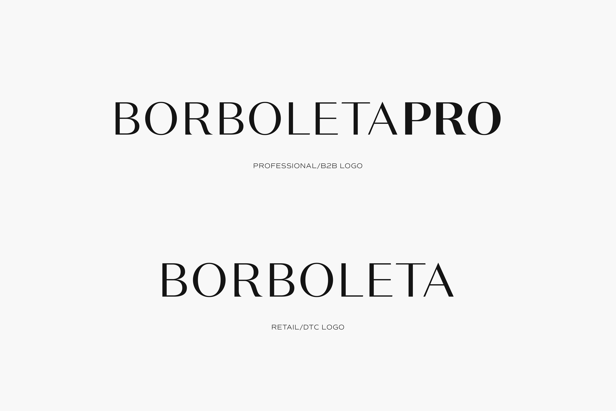
Logo Design
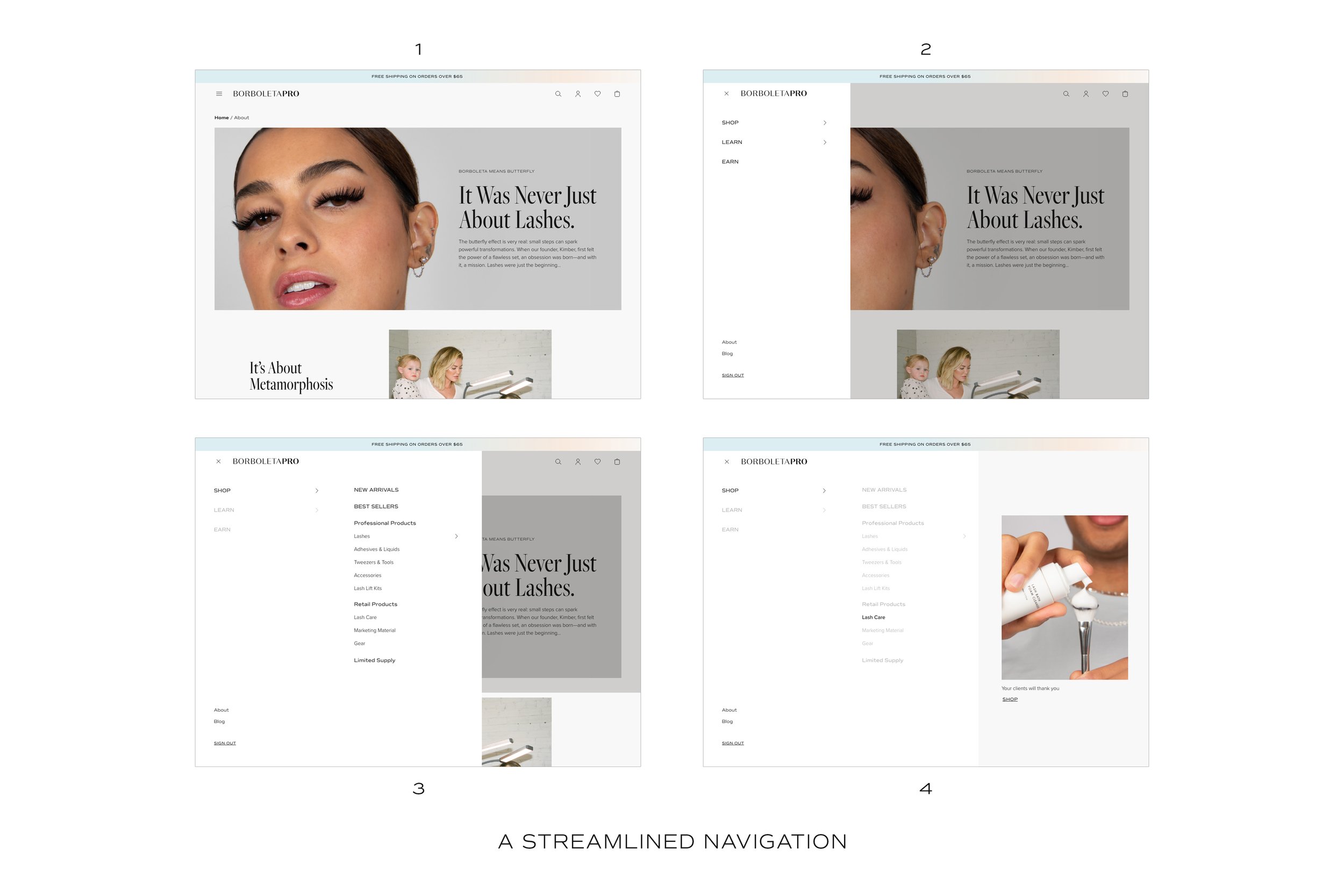
UX / UI
Website Design
Overview
Borboleta is a digitally native beauty brand dominating the fastest growing beauty service category—lashes. As the company continued to expand and launch into the DTC market, it became clear they had outgrown their brand and sought to reposition themselves for the future. As the Creative Director, I partnered with Marketing to guide the founder and executive suite through a brand and user experience transformation. Through this process we clarified the brand strategy, developed a new visual identity, and rehabed the entire Professional online shop.
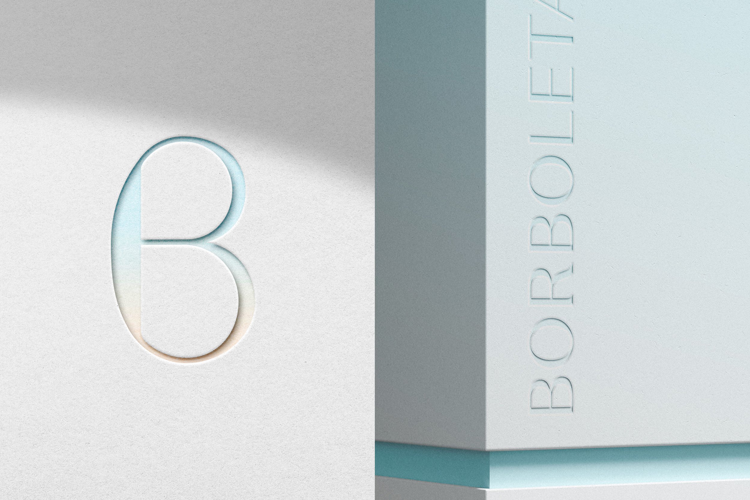
Brand Identity
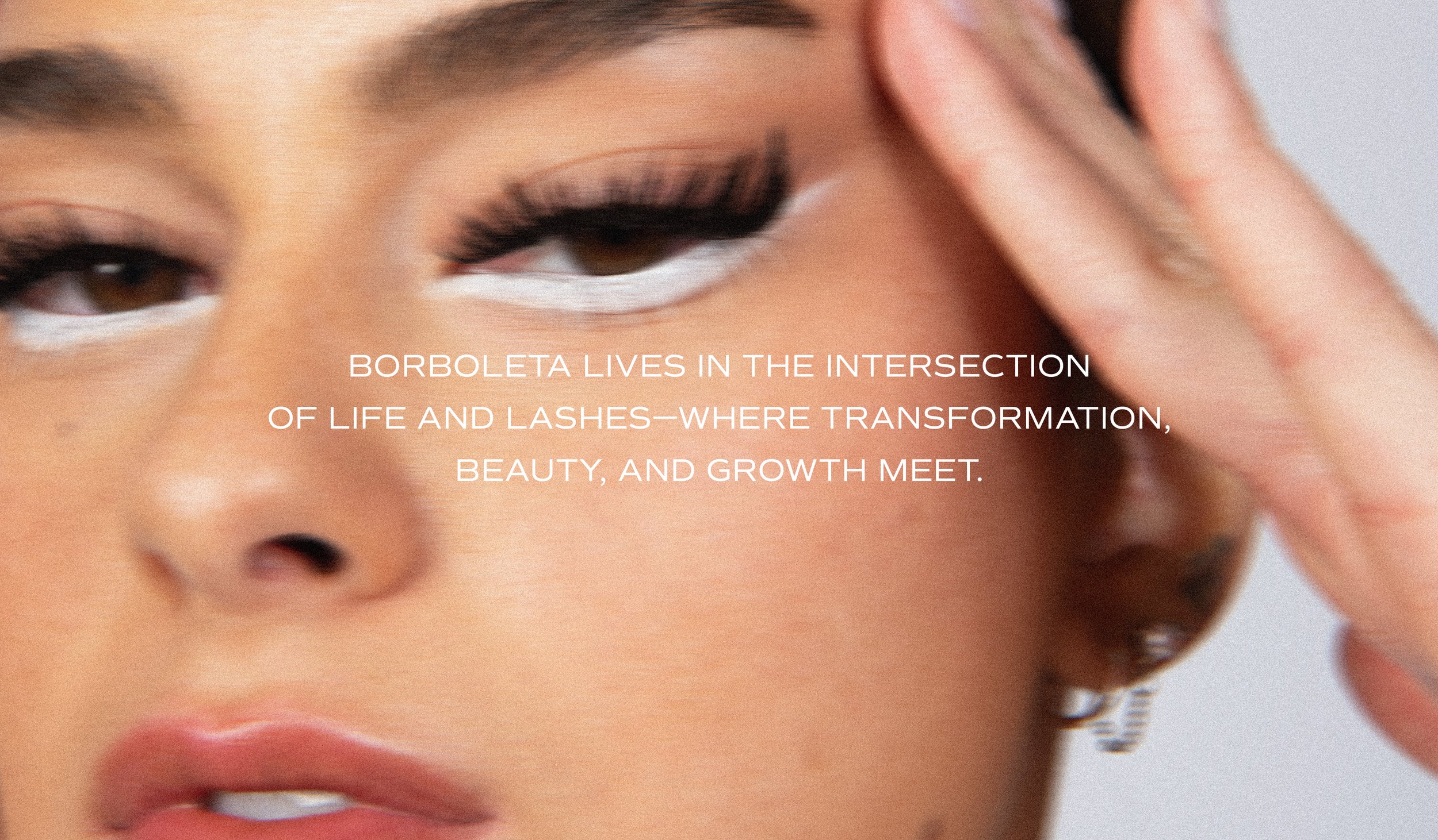
Inspired by its namesake (Borboleta means butterfly in Portuguese), Borboleta’s identity is airy, graceful yet bold, and playfully refined.
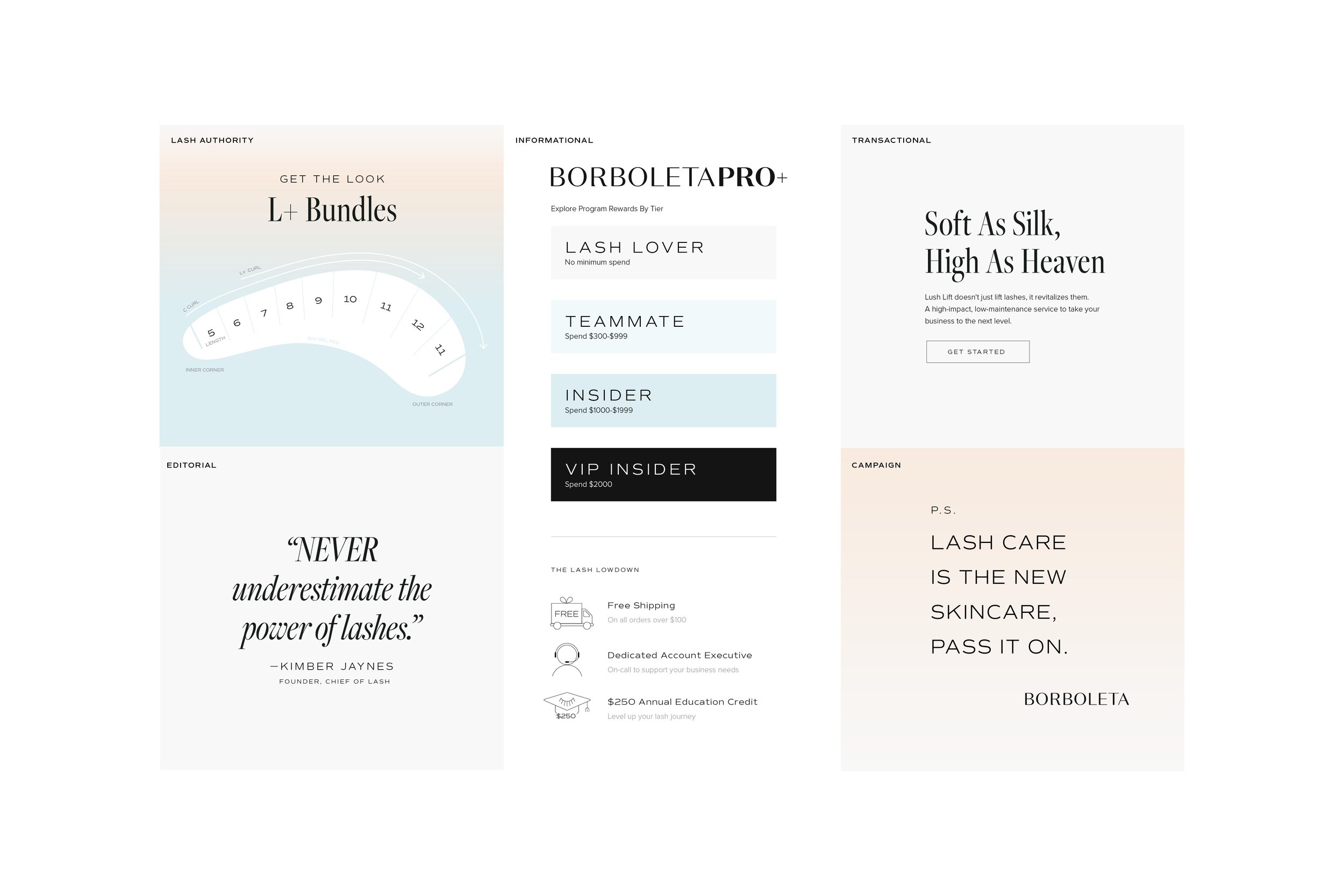

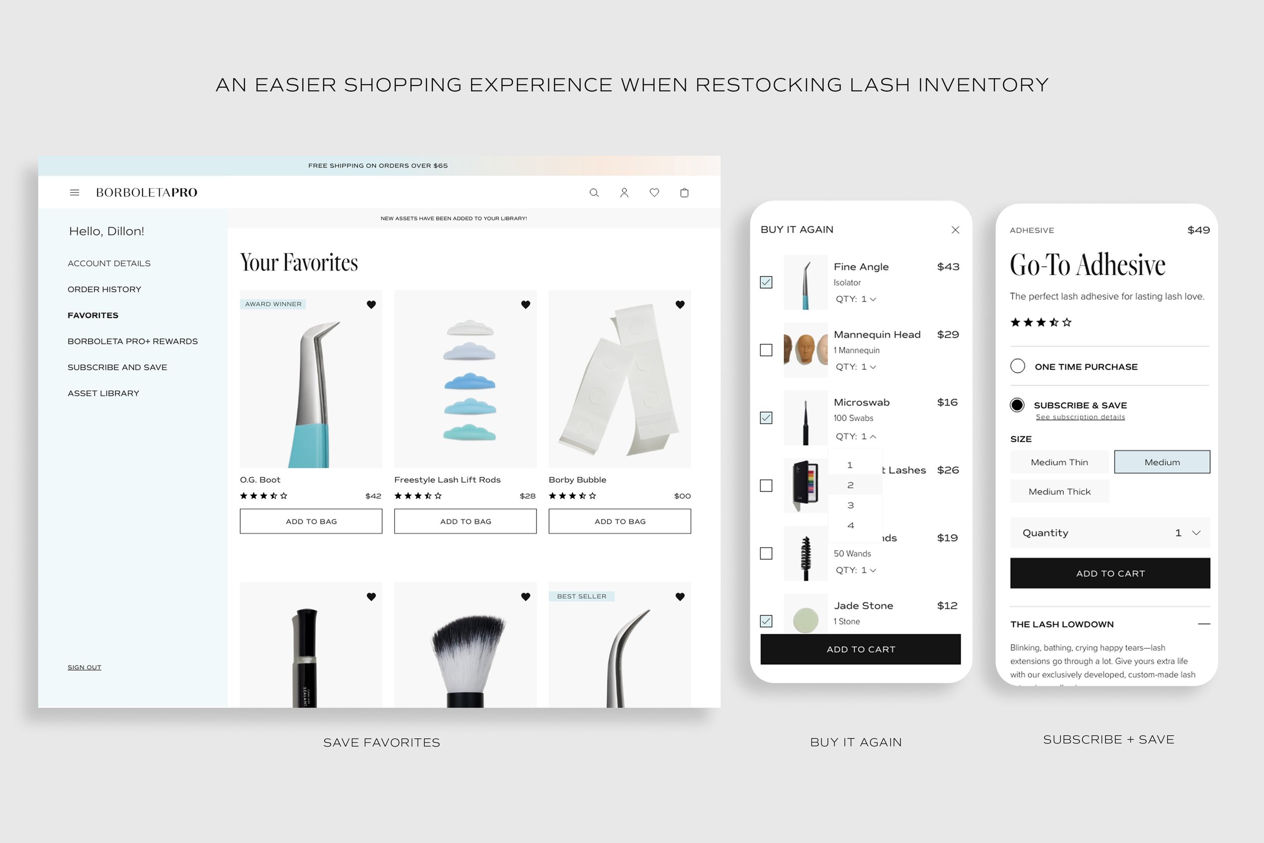
E-commerce Site Transformation
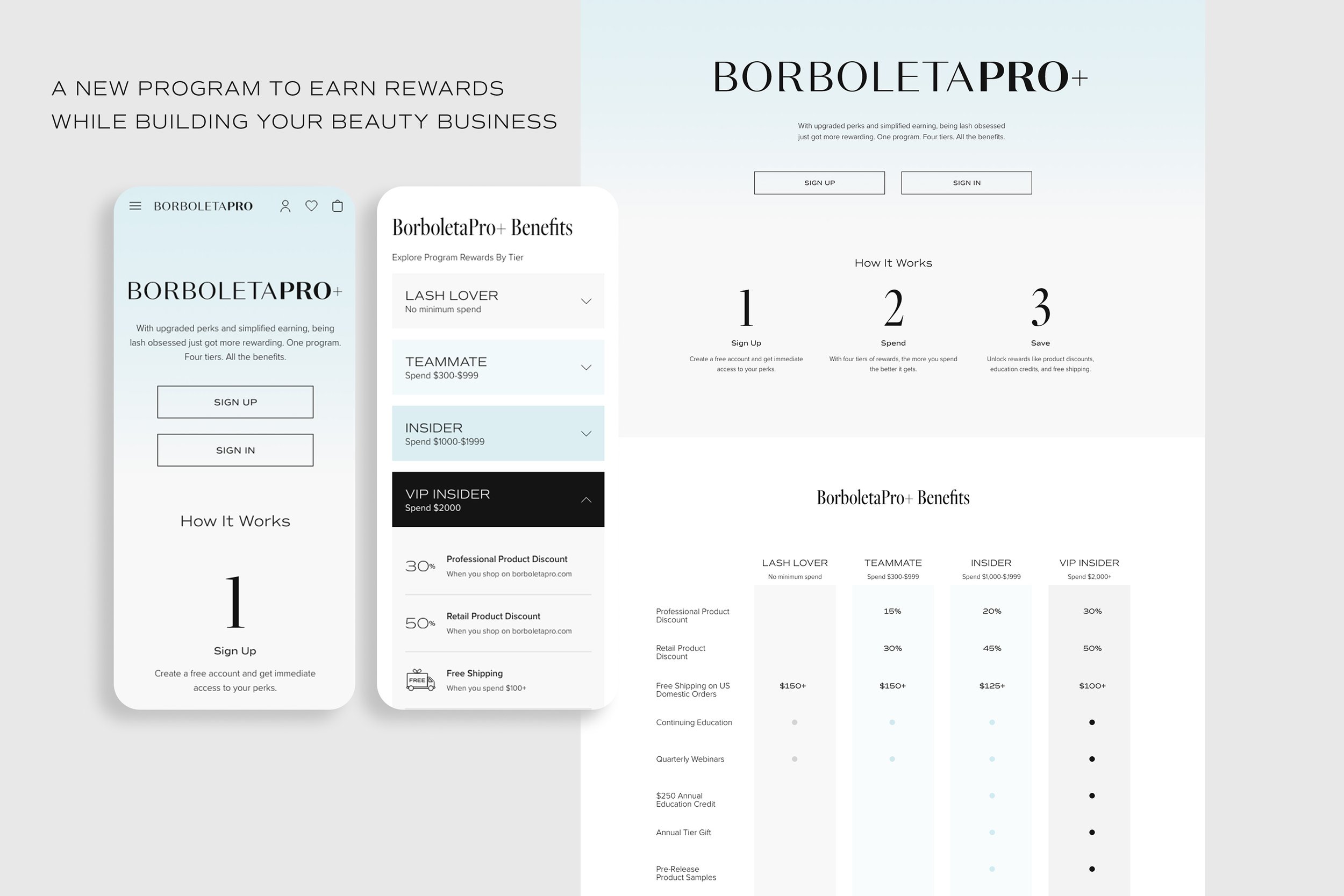
The BorboletaPro.com shopping experience underwent a major transformation. With new features like Buy It Again, Favorites, Subscribe + Save—and a rewards discount program—it is easier than ever to shop for lash supplies.


Brand Strategy
As the Creative Director, I helped identify key consumer insights, uncover Borboleta’s superpowers, and refocus the heart of the brand.

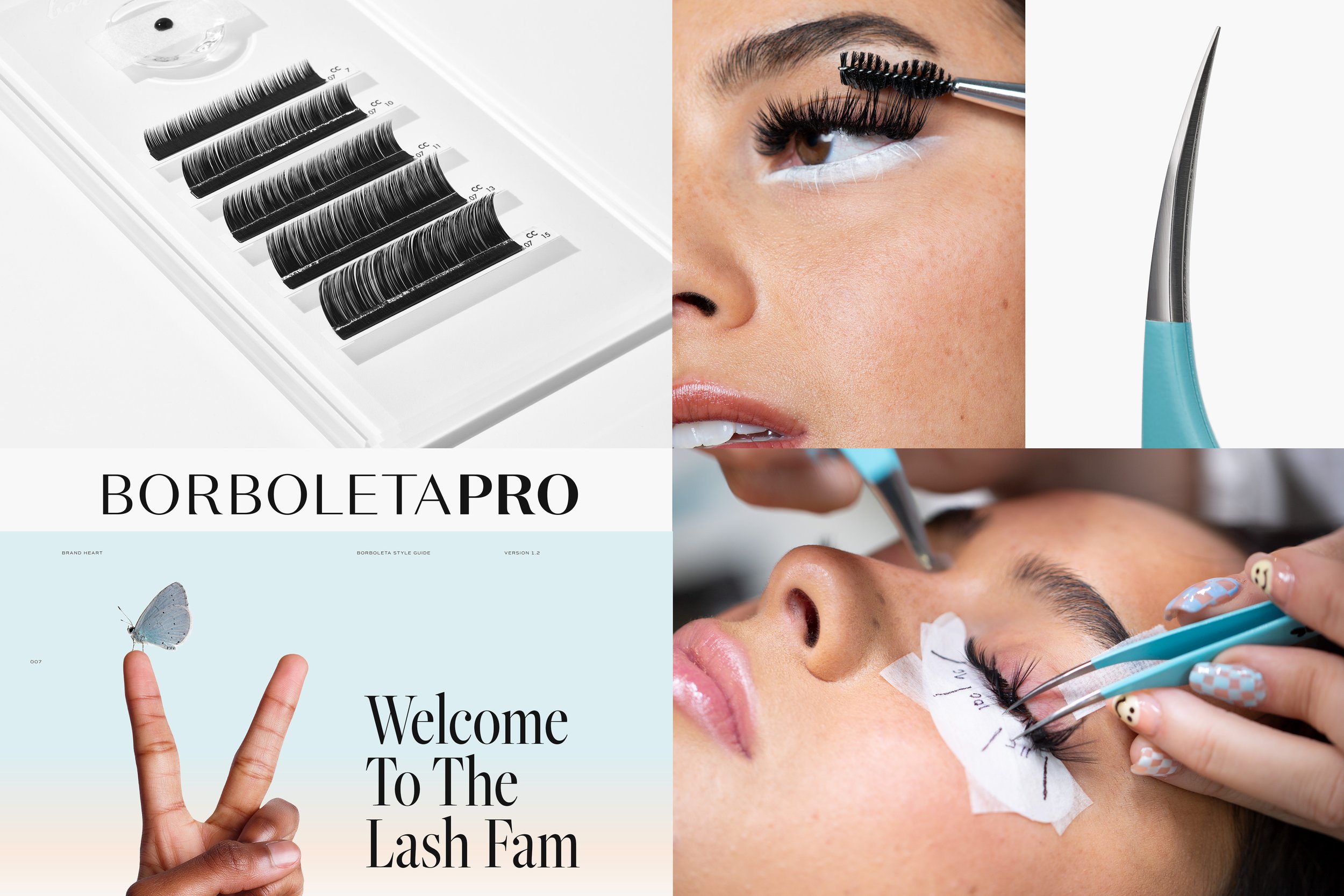
Previous Branding